At the Galleries
Group exhibitions have long been art world staples during the summer months. They can be minimum efforts showcasing the gallery’s stable, opportunities to try out new artists, not yet represented, or thematic shows that include work by sometimes better known people from other galleries. However conceived, they usually offer varied buffets ranging from the extremely engaging to the dull, with a lot in between. They are always a chance to see some reliable favorites and occasionally make happy discoveries.

“Interior Resonances,” the 10th Anniversary exhibition at Fridman Gallery, on the Lower East Side, was an in-house showcase. Selected by Regine Basha, it presented works by gallery artists, usually from the time of their first showing there, plus a sound installation and an ambitious program of screenings and special events. My attention was claimed most by a large, densely textured painting by Summer Wheat, cool geometric images by Remy Jungerman, and amazingly delicate constructions by Kazumi Tanaka. I’ve followed Wheat’s work for years and have seen all her shows at the gallery, so I was glad to have my memory refreshed by Pot of Gold (2015), an ample, big eyed, bejeweled woman clutching the eponymous vessel. A few coins spill, rhyming with her necklace and earrings—warm yellow ovals that join notes of ochre, lemon, and gold flickering across a pulsing field of varied grays. Wheat calls her works “paint tapestries.” Made by pushing pigment through a screen, they’re “woven” from repetitive ribbons of paint clustered into a thick, subtly inflected surface, more substantial than any textile, but with an insistent rhythm that hints at an underlying grid and, by association, interlocked threads. Our focus shifts between the assertive image and the complexity of the physical expanse before us.

I had last seen Jungerman’s work in the Dutch Pavilion of the 2019 Biennale di Venezia—stacked and hanging linear constructions punctuated with fabric, that have stayed with me. I missed his spring show at Fridman Gallery, so I was doubly pleased to see his confrontational inclusions in “Interior Resonances.” Jungerman’s work draws equally on his heritage as a descendant, on his mother’s side, of his native Surinamese Maroons (slaves brought from West Africa who escaped from the Dutch plantations) and his Modernist education in the Netherlands, where he lives. He combines geometric structure so severe that members of De Stijl would have approved with fragments of Maroon textiles and expanses of white kaolin clay (traditionally used in rituals). The exhibition’s larger work was a generous, staccato, slightly wonky grid of slivers of exposed fabric that interrupted a surface of kaolin, through which we glimpsed the ghostly presence of gridded textiles and edges, possibly abetted by drawing, as subtle and constant as a ground bass. The smaller works incorporated diagonals (anathema to some members of De Stijl) creating countervailing rhythms. I’ll make sure I don’t miss Jungerman’s next show.

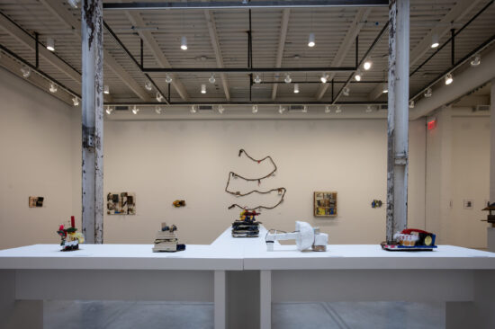
Kazumi Tanaka’s weird little objects are, we learn, functioning musical instruments constructed from animal skulls found in the woods, enriched with wire, wood, and the like. The examples in “Interior Resonances,” at once unspeakably intricate and slightly sinister, were elevated on slender rods, emphasizing their fragility and detailed construction. I would have loved to hear what these miniature instruments sound like. We are told that Tanaka’s intention is to give the defunct animals a voice beyond death. Maybe that’s why these eerie fusions of the natural and the meticulously man-made are both beautiful and scary.

“Plein Air” at Sears-Peyton, in Chelsea, brought together sixteen of the gallery’s artists who work (mostly) from perception of landscape, outdoors. Many works were small, attesting to the possibility of their actually having been made en plein air. Some seemed clearly the result of direct observation of the natural environment—which is not to say that they were literal—while others would have had completely different associations in another context. Vinna Begin’s small, richly colored watercolors translated landforms into sinuous, interlocking shapes whose hues suggested foliage, fields, and the like, intensified. While obviously informed by the particularities of landscape, they teetered on the brink of abstraction without losing their ability to suggest actual experience. Peter Schroth’s intimate paintings on paper were, paradoxically, as ambiguous as Begin’s, but also more naturalistic. Schroth distilled ocean, woods, and hillsides into apparently casual swipes of the brush, broad and textured enough to convey a sense of speed and spontaneity, along with indifference to conventional notions of reference. At first glance, his little images seemed almost haphazard, but with longer acquaintance they began to announce different qualities of light, weather, place, even time of year. There was more to look at than one first suspected.

As in many of her strongest works, the subtly modulated, brooding shapes in Poogy Bjerklie’s mysterious oil on paper, The Moonlight Fell (2022), read from across the room almost as a nineteenth-century nocturne, with echoes of Albert Pinkham Ryder or Ralph Blakelock. From a closer view, the modest painting became wholly contemporary— economically and boldly constructed with ample, directly stroked shapes. Scale shifted. We wondered whether we were close to the forms loosely suggested by frayed edges and suave brushmarks or at a great distance, under a pale expanse of night sky and a swipe of yellow? That uncertainty animated the work. There was no uncertainty about Rick Shaefer’s vast black and white drawing Two Old Maples in a Clearing (2020). At nearly five by six feet, it demanded that we acknowledge its virtuosity and its evocation of Old Master precedents; but those precedents were wrestled into the present by size that provoked associations with advertising and movies. It also made us wonder about that virtuosity. Did photography play a role in the drawing’s evolution? It certainly wasn’t done out of doors. Whatever its history, Shaefer’s unignorable drawing was an interesting foil to the exhibition’s small, obviously hand-wrought responses to the world around us.
“Beach,” at both of Nino Mier’s galleries, in Soho and Tribeca, curated by Danny Moynihan, may have been the largest and most wide ranging of the summer group shows. An effort to “explore all aspects of the shoreline,” from place of utility and danger, to desirable, albeit fragile zone for leisure, the show assembled works by about ninety artists, beginning with Eugène Delacroix and continuing to such current practitioners as Katherine Bradford, Janice Nowinski, and Kyle Staver, plus a gang of younger people, by way of such modern masters as Pablo Picasso, Henri Matisse, and George Grosz, with detours to include Janice Biala, Larry Rivers, Jane Freilicher, Joe Brainard, and Tom Wesselmann, among many others. The sheer size of the show was not surprising, since the gallery has multiple locations in Los Angeles, Brussels, and Marfa, Texas, as well as in New York, and lists something like fifty artists and estates on its website, plus another eight “exhibited artists.” “Beach,” however, included many not represented by the gallery. At first viewing, the amount of neo-quasi Surrealism, sly naughtiness, and sleek representation was overwhelming, but a little effort revealed a few more compelling works. It seems churlish to note that they were, for the most part, not by gallery artists.

Among the most memorable in Tribeca was Nowinski’s small Surfer (2020), with a few authoritative, seemingly effortless strokes conjuring up a confrontational figure, stripped to the waist, and his board, poised on end beside him. Bands of ochre, grey/blue, and blue located him, expediently, against sand, sea, and sky. In Soho, Katherine Bradford’s canvas of seated beachgoers in luminous glowing hues was another standout. Also in Soho, Kyle Staver, who shows with the gallery, was a dominating force with Margaret’s Mermaid (2023), a broadly painted, witty vision of a fish-tailed blond in the arms of a hunk, who carries her to shore amid a flock of seagulls with tails like tutus, welcomed by a cheerful lobster. Staver’s generous, swooping drawing, saturated color, and judiciously scattered details—a sturdy foot, scribbly chest hair, a seashell bra—added to the painting’s exuberant, playful affect.

“Anarene,” at 532 Gallery Thomas Jaeckel, in Chelsea, curated by the British artist Danny Rolph, was as modest and focused as “Beach” was sprawling. Rolph selected a dozen painters from different continents and different generations, as well as his own work, in one of the most consistent and satisfying of the summer group efforts. Along with two of Rolph’s vaguely urban jangles of crisp planes in full-throttle colors, there were monochrome gray derelict factory interiors by the Cuban-born painter Alberto Alejandro Rodriguez, disciplined images in which geometry nearly overwhelmed sometimes discordant details that made the image specific. It was a nice surprise to see a 1965 watercolor by the late British abstract painter John Hoyland, constructed with bands of color aligned across the page, punctuated by small squares at the bottom. Hoyland’s work is not often seen in this country, and when it is, it is usually more recent. A forthright pastel by the American-born English resident painter Chantal Joffe, Self-Portrait in Union Square (2015), was as firmly constructed with blocks of color as the Hoyland, but here the scrubby zones of off-whites and off-blacks surrounded and created a wide-mouthed woman, under a fetching pink hat. London-based Mali Morris’ smallish Mifsud (2009) was a brushy expanse of lush brown/purple, all-but obscuring a checkerboard of clear, delectable hues, with equally delectable discs of a range of yellows and one emphatic pink nailing down the rapidly stroked central zone. As with all of Morris’ work, questions of what is on top of what, of how overlays modify color, and of differences in edges made a deceptively straightforward painting endlessly rewarding. A small pastel by Chris Ofili, a blue figure almost subsumed by a dark field, added another note to the British contingent. And more. I’m not at all sure what the works on view had to do with the title of the show, which, we were told, referred to the Texas ghost town where The Last Picture Show was set, but “Anarene” gave us a lot to consider.

Another kind of group presentation, of multiple solo shows, is standard fare at Pamela Salisbury Gallery in Hudson, New York, at least in the warmer months, when the exhibition in the two-level street front space is joined by works installed in the four-story carriage house behind and sculpture in the courtyard between the two buildings. The gallery often combines established artists with less familiar and emerging practitioners, making it an essential part of the steadily expanding Hudson Valley art scene. Last summer, “Elisa Jensen: Radiance”—paintings of interiors and views out of windows—overlapped with “Elisa D’Arrigo: Balancing Acts”—ceramic sculptures with extraordinary surfaces—and “Maud Bryt: Recent Work”—abstract watercolors and canvases. Jensen conflates perception of places well known to her with memories of those locations at other times, heightening color to suggest (without imitating) qualities of light at different times of day and different seasons. Simplified, evocative landscape references are disciplined by the geometric openings through which we glimpse them. An assertive dark vertical line keeps an exuberant, stippled pink magnolia in its place; a declarative golden brown window frame holds a luminous, deep blue sky and a slash of blue river at bay, its centralized verticality challenged, in turn, by repetitive, slender railings and the diagonal edges of open panes. Jensen is clearly an admirer of Pierre Bonnard, but her improvisations on lived domesticity are wholly her own. Viewed on a hot July evening, “Radiance” seemed to translate summer leisure in the countryside into firm structure, cropped viewpoints, and, above all, lush, saturated color.


D’Arrigo’s endearingly idiosyncratic ceramic sculptures have the scale and, in some ways, the material presence of useful objects, but there the resemblance to anything familiar ends. Swelling forms sprout irrational appendages, slender spouts become props and legs. A portly volume becomes a confrontational, headless being with firmly planted forelegs. Sometimes we can peer into the forms, hinting at their kinship to vases and pots, but ultimately, it is the new, personable entity that compels and holds our attention. The lively surfaces of these engaging creatures—richly textured, complex tapestries of subtle color—further enliven D’Arrigo’s unnameable forms. At once very serious and funny, elegant and a little brutal, slightly Surrealist and playful, her eccentric works are impossible to forget.

Maud Bryt’s watercolors are notable for their freshness and sense of light. Air circulates through them. They seem to distill specific places and perceptions into wholly abstract pools and patches of transparent, often unexpected color, capturing a sense of the particular without representing it literally. Some of her floating configurations suggest the out of doors, others interiors, still others the built environment, with blocky marks that often loosely echo the foursquare proportions of the support. Sometimes the blocks suggest piled constructions—not surprising, since Bryt is also an accomplished sculptor who builds composite structures of rough, geometric masses. Her canvases share some of the clear structure of the watercolors, but they are less windblown and light-struck, opaque, rather than transparent, and apparently less spontaneous. I hope that the energy and vivacity of her watercolors will find their way into her canvases.

The summer had its share of notable one person exhibitions, as well, among the most engaging Jim Condron’s “Collected Things: Sculptures from the Collected Items of Artists, Writers and Thinkers” at Art Cake, in Brooklyn. Condron upped the ante on his witty combinations of unlikely materials by asking his friends, mostly fellow artists, to give him things that had personal meaning but that they were willing to have transformed into sculpture. The objects ranged from a vintage Nordic Track, to playing cards, to a typewriter keyboard, to boot soles, shells, costume jewelry, a pillow, studio detritus, and a surprising amount of fur, plus the last pair of bright pink Crocs that Grace Hartigan wore to paint in, before her death. Condron assembled the donations into about forty of what amount to metaphorical “portraits” of the donors that, in odd ways, seemed to resonate with the history and use of the items. The real individuality of each work was, of course, the result of Condron’s ability to assemble his sometimes improbable components in inventive ways, never repeating himself, but apparently responding to the variousness of his materials and, possibly, to what he knew of the donor. Some sculptures were discrete objects, others wall-hung assemblies. An antique rope, festooned with small objects collected by the donor, snaked against the wall, while an antique birdhouse, a vintage book, and some of the artist donor’s drawings and studio materials were stacked into a complex pile of intersecting planes. Many of the works were boldly colored, in part because the donations included used paintbrushes and the skin from the interior of paint mixing bowls, although color is always part of Condron’s vocabulary.


In addition, Condron showed a group of very small “non-portrait” sculptures, plus a few larger, freestanding pieces, similarly assembled from rather random fragments of plastic, wood, cotton, and more. They shared the cheerful (deceptive) casualness of the portraits, but a strong family resemblance among the small works made them less individual—although not less appealing—than the “Collected Things.” What was perhaps most impressive about the entire exhibition is that the new object that Condron constructs with his miscellaneous components always dominates. We study the sculptures for their formal merits and interior relationships, only gradually realizing the identities of the assembled parts—and sometimes not even then. The constructions in “Collected Things” were entirely satisfying as sculptures. And they were enormous fun!
Among the most ambitious exhibitions of the summer, “Edvard Munch: Trembling Earth,” at the Clark Art Institute, Williamstown, Massachusetts, introduced a little-known aspect of the Norwegian Expressionist’s work. Munch’s name is inextricable from images of anxiety-ridden, phthisic adolescent girls, predatory women, brooding men, and ambiguous images of the moon and its reflection. And, of course, there’s The Scream, one of the few Modernist works as recognizable and as frequently parodied as Mona Lisa. But, it turns out, there’s another Munch, a painter of forests, farm scenes, and the occasional stormy sky. Jointly organized by the Clark, the Museum Barberini, Potsdam, Germany, and the Munch Museum, Oslo, Norway, the exhibition assembles paintings, prints, and some works on paper to explore Munch’s landscapes, farmscapes, and responses to dramatic weather, with a few figure paintings and self-portraits, made between 1893 and 1942. (Born in 1863, Munch died in 1944.) Some of the celebrated, supercharged images, including The Scream, are accounted for in modest lithographs.
The earlier works, more densely painted and usually with more saturated color, are often the most compelling. The paintings made after the 1920s tend to be more thinly painted, with ribbony strokes. In the earlier works, extremes of weather brought out the best in Munch, as in Winter in Kragerø (1912), a view from a high slope of a snow-covered town, below an immense pine. The rooftops become a near-Cubist accumulation of geometric planes, sketched with blue lines. White Night (1900–1901) plays silhouetted black/blue trees against a pale, agitated sky and pale ground plane, interrupted by a band of spiky black/green evergreens. Sometimes apparently neutral scenes share the agitation we expect of Munch. From Thüringerwald (1905) translates a landscape view into swirls of purple/pink and a wall of deep green foliage. A more pastoral subject, The Apple Tree (1902), is presented with the same intensity.
The later works mostly lack the emotional charge of earlier works. The drawing is accomplished but unsurprising in paintings of farm laborers and ploughing with horses, from the ’teens; the robust plough horses fitted into the confines of the canvas have a certain appeal. Images of nude male bathers from 1907 and 1908 seem to have engaged Munch more fully than the clothed farmworkers, although given his repeated characterization of women as ferocious seductresses, there may be other reasons besides chronology for the difference. A section devoted to beach and shore imagery includes a scene of piled boulders by the sea from 1904 and a remarkably loose, rhythmic study of waves from 1908 with horizontal rows of marks with different rhythms and spacing. It seems to be a study for the background of a painting of male bathers, but it suggests that Munch could have been a very different artist had he been more interested in Modernism.
The beach and shore section includes early paintings with Munch’s “signature” suggestive moon and reflection configuration, sometimes with mournful, tense figures beside the sea, as well as lithographs and woodcuts of what appear to be bad breakups. They’re the most familiar images in the show, but in the new context of some all-stops-out paintings of a dazzling, explosive sun and of stormy skies, it’s possible to see them in fresh ways. Was Munch embodying forces of nature? According to the very comprehensive catalogue and other texts, his landscape and nature paintings suggest a sensitivity to the natural world that makes them particularly relevant to our present era of climate change, extreme weather, and catastrophe. Maybe. Whatever we think of that idea, the exhibition allows us to learn a great deal about an artist we thought we knew well.

I was fortunate enough to be in Fort Worth not long after “Jammie Holmes: Make the Revolution Irresistible” opened at the Modern Art Museum, the artist’s first solo show in a museum, organized by María Elena Ortiz. Born in Thibodaux, Louisiana, and now resident in Dallas, Holmes paints elegantly constructed images rooted in the Black experience of his hometown: scenes of mourning, religious gatherings, family relationships, and the like, populated by simplified but eloquently drawn figures. We learn that Holmes, his sophisticated touch and sense of structure notwithstanding, is self-taught, but he is clearly an admirer of Kerry James Marshall and Henry Taylor, perhaps of Kehinde Wiley. Holmes’s paintings are very much his own, however, with a resonant palette, sometimes dominated by the sumptuous brown of skin tones, sometimes sparked by milky pastels, occasionally embellished with scrawled words and with glitter à la one period of Marshall. The show’s title comes from a statement by the writer and film maker Toni Cade Bambara: “as a cultural worker who belongs to an oppressed people my job is to make revolution irresistible.”

The installation includes a small, slightly ruined schematic church building—or, as it says on the front, “CH RCH”—with vegetation growing on the roof, in the center of the gallery. We peer in to see a TV with scenes of immersion baptism and a figure wandering through the woods with a painting of Jesus on the back of his jacket, plus framed photos of Martin Luther King, Jr., and (I think) John F. Kennedy. Primed by the TV images, we focus intently on the painting Blame the Man (2021), an immersion baptism of the artist, who turns his head to stare at us from a roiling expanse of celadon green water. Images of a mother and child, and of two children are made into indictments of today’s continuing violence by their mourning tee shirts, apparently a commonplace form of tribute in the South these days. A large homage to the Black Panthers’ social programs, with an oversized zebra, plays havoc with scale for expressive drama. A 2021 self-portrait of a figure seated on a picnic table in a tan/brown parched landscape and a 2020 painting of the artist cutting his brother’s hair, against a flowery background, were also memorable. I look forward to seeing more of Holmes’s elegiac, unpredictable images.
