At the Galleries

Masks and proof of vaccination requirements notwithstanding, the past season of the art world seemed almost normal. Postponed exhibitions finally opened. The New York and Miami art fairs returned. The most talked about phenomenon may have been the remarkable fact of the concurrent Jasper Johns exhibitions, both titled “Mind/Mirror,” at the Whitney Museum of American Art in New York and the Philadelphia Museum of Art. On view until mid-February 2022, each is a complete retrospective, with a slightly different emphasis, a paired overview never accorded any of Johns’s peers. The shows trace his path from the early Flag, Target, Number, and Letter paintings, with their banal images and lush surfaces, to the obscurely allusive, deliberately uncommunicative recent works, revealing the constants and variables in his evolution—along with his shifting conceptions, his exploration of different materials and methods, and his unstable relationship to reference. Separately and together, the two versions of “Mind/Mirror” provide everything anyone could conceivably want to know about Johns. Maybe more.

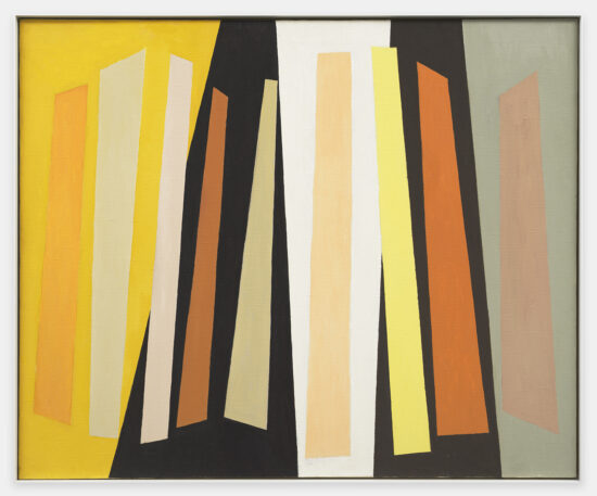
As a more varied diet, the past season also offered little-known works by a postwar sculptor, a surprise from a modern master, responses to a special location by young contemporaries, and an impressive number of exhibitions by women, both those working currently and from the recent past. To begin with the women, at Washburn Gallery in Chelsea, “Alice Trumbull Mason: Shutter Paintings” presented severe, elegant works from the early 1960s by a pioneer of American abstraction. Mason (1904–1971) was a co-founder, in 1936, of American Abstract Artists, a still vital organization, so high-minded in its early years that Piet Mondrian joined when he came to the U.S. in 1940. Always dedicated to geometric abstraction, Mason explored multiple approaches to the discipline over the years, producing some of her strongest work in her last decade. Witness the confrontational Shutter Paintings at Washburn Gallery, with their angled vertical bars and cool palette of off-greys, tans, dull blues, tempered yellows, and flashes of orange and black, with hues varied and combined differently in each canvas. We follow the progression of colors across the surface, noting the changes that make the verticals shift and jostle. While the essential format remains the same, the differing chromatic relationships and the bars’ subtle shifts away from verticality give each painting an individual rhythm and mood. Mason was largely underrated and ignored for much of her working life, but things are changing. A major monograph was published last year, when Washburn mounted a virtual mini-retrospective, and auction prices, I’m told, have risen dramatically. That’s good news if you care about the history of modern art in America.
At Eric Firestone Gallery, in NoHo, “Memories of Tenth Street: Paintings by Pat Passlof, 1948–1963” assembled early works by another feisty, unstoppable painter and influential teacher. (Full disclosure: I was the curator of “Pat Passlof: The Brush Is the Finger of the Brain, Paintings 1949–2011” at the Milton Resnick and Pat Passlof Foundation in 2019.) Passlof (1928–2011) was the protégée of Willem de Kooning, with whom she first studied during a summer at Black Mountain College. The young woman’s work so impressed de Kooning that he suggested that she study privately with him instead of returning to college. The earliest of Passlof’s vigorous abstractions at Firestone, with their slashing, delicate lines and tossing planes, date from this period. Painting abstractly, Passlof said, was a way of rebelling against de Kooning. Recapitulating his own academic training in Rotterdam, he required her to draw naturalistic forms in pencil, a grounding that probably accounts for the spatial vitality of the paintings on view.

The selection makes clear Passlof’s inventiveness as she shuttled from gatherings of brushy planes to all-over expanses punctuated with floating incidents to pulsing, fraying fabrics of color, always responding to the suggestions that emerged as she worked. What is constant is sensual paint application and unexpected color. Passlof attracted attention early on but then put less effort into advancing her own career than that of her husband Milton Resnick (to whom de Kooning introduced her). In the early 1990s, she began to show regularly once again in New York and, like Mason, is becoming more visible. Through it all, Passlof was an inspiring teacher, committed to the studio, and making terrific, tough, gestural abstractions, occasionally haunted by centaurs and horses, always distinguished by surprising color and seductive surfaces, virtually until her death. Let’s hope for more surveys of the rest of her long working life.
A little further downtown, at Peter Freeman Inc., on Grand Street, “Catherine Murphy: Recent Work” showed astonishing drawings and paintings made between 2018 and 2021. Murphy is at once a virtuoso perceptual realist who always works directly from the motif and an uncompromising abstract painter. Her attention is claimed by things the rest of us fail to notice—reflections, light rippling on a plastic bag, the conversation between the stripes of a folded shirt and suitcase straps—at the same time that she focuses on the relationships of textures, patterns, and shapes independently of what they are literally part of. She confronts us with her discoveries, usually shown larger than life, which intensifies their abstract qualities. Murphy abolishes the horizon, cancels (for the most part) fictive depth, and denies us a place to locate ourselves within the painting, so we are forced to concentrate on her confrontational images as pure visual phenomena. Her forthright compositions heighten the tension between her meticulous realism and the apparent irrationality of her choice of the subjects she presents so convincingly. Her sensitivity to nuances of light brings the ephemeral and the passage of time into the discussion, enriching and complicating the already complicated reading of her work. Murphy’s rigorous paintings and drawings are aggressive in their demand for close, extended looking, but they also reward that effort.

Among the most memorable works was Canopy (2020), a tight cluster of plastic buckets filled with water reflecting the trees above. In some, we see the bottom of the buckets, creating an ambiguity between surface and depth, transparency and opacity, comparable to the interchangeable reflections and floating pads and blossoms in Monet’s paintings of his lily pond at Giverny, here translated into a contemporary Home Depot vernacular. But just as we begin to grasp the complex illusionism of Murphy’s image, we are seduced by the way the circles of the bucket rims become a geometric screen of near-primary red, blue, yellow, and orange, cropped by the edges of the square canvas. We move into a realm of pure geometry, far from anecdotal reference to nature, and then are captured, once again, by the specificity of the image. In Bag of Rags (2019), a miscellany of colored cloths jammed into a transparent bag provokes exploration of other kinds of layering. The ripples of light on the crumpled plastic are as suave and improvisatory as the highlights on an infanta’s embroidered skirt. The gorgeousness of Murphy’s paint handling argues with the utilitarian subject matter, while the bulging bag—or is it two?—barely contained by an office chair and framed by burgeoning shadows, becomes animate, even anthropomorphic, the bulges tenderly interlocking, off-center, against the square canvas. All this, plus unignorable “portraits” of wallpaper, a doormat and flagstones in snow, and a surrogate crime scene enacted by a dressing gown tossed down a flight of stairs. And that’s not to mention the obsessive, unforgettable drawings.
Back in Chelsea, at Thomas Erben Gallery, Janice Nowinski showed idiosyncratic, mesmerizing paintings. Her intimate works, some not much larger than a sheet of paper, read surprisingly well from a distance, against pastel walls, but also pulled us toward them. We came close to savor apparently casually indicated reclining nudes, images of her stylish grandmother in chic black, a figure in a pink bathing suit, and riffs on old and modern masters, among other things, all based, we learned, on other works of art, family photographs, and pictures encountered in the media. Nowinski often returns to motifs, making subtle adjustments, probing the implications of earlier solutions. I recalled being struck by a version of the bathing suit picture some years ago, in a group show, a memory supported by the title of the present, 2020, painting—Pink Bathing Suit #8—the backlit, frontal figure and hot pink one-piece made luminous by a clear blue ground suggesting water.

At first acquaintance, Nowinski’s figures seem to have been dashed off with minimal effort, using the fewest possible strokes to suggest a pose, with figures looming against schematic backgrounds, in a subdued range of hues. The artist’s colleague and admirer, Katherine Bradford (a brilliant painter herself), recently observed that Nowinski “makes the rest of us look like we’re trying too hard.” Despite this appearance of effortlessness, these moody, quirky works soon reveal how potently Nowinski suggests postures, body types, weight, and poise with seemingly accidental inflections and shifts in brushmarks. The most recent paintings at Erben were often the strongest: Nude in Front of Mirror (2021), her back toward us, canted forward, with a flying blue drape, upper right, or Nude with a Dog #1 (2021), one with folded limbs, one with outstretched paws, both boldly facing us and called up with broad strokes of black and white. The longer we spent with each work, the more nuance and sheer painterly intelligence we discovered.
Uptown, at David Nolan, “Dorothea Rockburne: Giotto’s Angels & Knots” celebrated the artist’s continuing fascination with knot theory, the Renaissance, geometry, and combinations of sometimes unlikely materials. A gallery transformed into a quasi-votive, dark ultramarine space housed a series of new works—Blue Collages, Angels, and Giotto Drawings—all loosely inspired by her lifelong admiration for Giotto’s frescos in the Scrovegni Chapel, in Padua, especially by the anguished, mourning angels hovering in the deep blue sky in The Lamentation of Christ. In Rockburne’s works, the varied attitudes of Giotto’s angels, articulated against the flat dark blue, become nested angles, their silent cries become drips, abstracting the intense emotion but retaining a memory of the colors and affect of the original. Elsewhere, the Trefoil series plays rectangular planes, some sleek and brilliantly colored, others matte and neutral, against circles of copper wire. The layered rectangles shift in proportion, size, and relationship, like a deck of cards being shuffled, now extending horizontally, now compressing, now moving upward, now symmetrically deployed, now not quite so symmetrical. The circles hover against the planes or partly disappear beneath them, suggesting that the wire is continuous, a visualization of the metaphorical knots of knot theory—loops that can twist or warp but are endless and cannot be untied. Yet for all the geometric clarity and clear-headedness of the Trefoils, everything seems to be in flux, potentially mobile, as if the stacked planes could slide or flip into new configurations, free of the constraints of the wire. Rockburne’s initial impulse seems as grounded in minimalism as her early, glorious drawings made by folding and unfolding sheets of paper against the wall, courting shifts in direction, tracing the results, and continuing the process across the surface. Her recent work is no less rigorous or pared down, but there’s an intensified sensuality in the Trefoils and the Giotto series.

Rockburne has long made substantial wall-mounted works that seem to acknowledge the three-dimensionality of the space they inhabit, no matter how closely they cling to the wall, so it was surprising to learn that the exhibition’s two pugnacious constructions were Rockburne’s first forays into freestanding sculpture. They combined such unexpected materials as bentwood chairs and galvanized tubs, one filled with water, one with a mirror, plus clamps, automobile tires, and hawsers thick enough to tie up a transatlantic liner, all of it pristine and new. The loops of the overlapping chairs entered into a dialogue with the loops of rope, echoed by the stacked rings of tires—more knot theory made tangible. Still more complexity was added by the reflections and the jolt of realizing the unlikely parity of water and mirror, while the difference between the workaday identity of the components and their immaculate state was invigorating. Their bulk and unignorable presence notwithstanding, we read these improbable objects almost as we did the delicate Trefoil series, tracing the suave curves of the chairs and the stacked tires and the path of the rope. Rockburne, as usual, kept us slightly off-balance and deeply engaged.
Downtown, again, at Zürcher Gallery, on Bleecker Street, an exhibition by a male artist. “Tom Doyle in Germany 1964–65” introduced a group of essentially unknown constructions, mainly in iron and wood, by a sculptor known for swoopy, oversized, uneasily balanced, rough-hewn wooden structures. Doyle (1928–2016) made the works at Zürcher during a fifteen-month-long sojourn near Düsseldorf, working in an abandoned section of a factory owned by a German industrialist patron who had invited him and his wife, the artist Eva Hesse, to make art there. Doyle had time, generous skylit space, and a wealth of potential components, including disassembled, discarded machine parts. The situation and the unfamiliar materials provoked a series of about 50 quirky polychrome assemblages made of found and welded steel, cast iron, carved wood, bent Masonite, and wire. Stored in Germany, after the couple returned to the U.S., the sculptures were exhibited at the Moderna Museet, Stockholm, in 1984, then packed, shipped back to the artist in America, and never unpacked—until recently.

The most engaging of the series, poised on wonky tripods and splayed slender bars or balanced on stalks, thrust indescribable forms, both made and scavenged, into the air, embracing chunks of space or extending outwards in precarious cantilevers. The internal relationships were elusive and sometimes fleetingly anthropomorphic. Take Sedentary Taurus (1965), for example—the largest “tripod,” with an elevated scoop above a slanted, downward thrusting plane, its disparities accentuated by a palette of off-brown, near-purple, and, where you least expected it, green—or Rally Al Round (1964)—yellow projecting cone, dark triangle, and boxy green “head” on a stick, all supported by a green column. A small, untitled tripod of painted wood, steel, and wire (1964–65) was equally notable. As with David Smith’s and Anthony Caro’s sculpture, it was impossible to anticipate the other views of Doyle’s work from any one viewpoint, partly because of the way the solid elements were folded, torqued, or arc-ed, partly because the sculptures, while extremely open and visually penetrable from all sides, were so aggressively and unpredictably three-dimensional. The best were notably fresh and thought-provoking, and we must be grateful to Zürcher Gallery for bringing them out of obscurity and for accompanying them with an informative catalogue documenting the entire project. We learn that Doyle never expected the sculptures to leave Germany. Why he abandoned their seemingly fruitful and provocative direction remains a mystery.
For pure revelation, nothing could beat “Arshile Gorky: Beyond the Limit” at Hauser & Wirth in Chelsea. It’s a remarkable story. In 1946, Gorky and his family spent their third and last summer at the Virginia property, Crooked Run Farm, owned by his wife’s parents. He could only draw during this stay because the barn he had used earlier as a painting studio had been destroyed by fire, working outdoors to produce almost 300 drawings in response to the natural world around him, especially to plants and weeds seen up close. Back in his New York studio, in 1947, Gorky painted a large work on paper, the elegant, economical The Limit (Private Collection), with its pale brushy zones, its small, crisp, brightly colored shapes and suave larger elements, punctuated with delicate lines, drifting against a grey green field. The paper on which The Limit was painted had been taped to a stretched canvas, probably when damp, to that it would dry as a taut, smooth painting surface. Suspicions that there was something on the underlying canvas were confirmed last year, when conservation of The Limit revealed a pristine, lyrical painting, now known as Untitled (Virginia Summer)(c. 1946–47, Private Collection). The evocative, tenderly colored configurations that levitate in the loosely stroked, pale blue, layered expanse of the newly discovered work were already familiar from their presence in many of the black and white drawings, some with swipes of colored crayon, made during that last summer in Virginia. But despite Gorky’s obvious interest in whatever triggered these images, no corresponding painting had been identified—until now.

At Hauser & Wirth, the two paintings are set side by side, contextualized by a selection of related drawings. The combination underscores how specific Gorky’s seemingly improvisatory images were for him. We follow as he repeats particular “characters,” assembling and reassembling them, with slight variations, to perform mysterious dramas, like a theater director rehearsing a cast. “Beyond the Limit” includes an informative film, made by Gorky’s granddaughter, Cosima Spender, documenting the history of the discovery, as well as an interactive screen on which we can consult the newly launched, updated, digital Gorky catalogue raisonné—if we can tear ourselves away from the two seductive paintings and those irresistibly beautiful drawings. There’s a really good catalogue, as well.
A trip to Snug Harbor, on Staten Island, the complex of early nineteenth-century buildings, once a home for retired sailors, now a cultural center and botanical garden, was required to discover “Roots/Anchors,” an absorbing group exhibition in a grand former residence building, the Newhouse Center for Contemporary Art. Discovering an 1898 essay by a young Theodore Dreiser about Snug Harbor’s virtues and the discontents of its landlocked inhabitants, nostalgic for their former lives, Will Corwin invited Katie Holten, Shervone Neckles, and Xaviera Simmons to join him in responding to the site and its history, informed by Dreiser’s article. Inspired by Snug Harbor’s association with travel and displacement, and the multiple associations, both terrestrial and maritime, of the words “roots” and “anchors,” the artists often drew on their own histories in their work, which resonated with the show’s siting in the ample ground floor rooms of the Greek Revival building with its (later) Tiffany decorations of ships in stained glass and nostalgic homilies.

Shervone Neckles, an Afro-Grenadian-American, makes notably varied work, informed by her Caribbean heritage, to comment metaphorically on notions of colliding cultures, the diaspora, and enslavement. A miscellany of two- and three-dimensional objects suggestively combined roots (or branches), a conch shell, velvet, embroidery, fringe, and more, triggering conflicting thoughts about Caribbean festivals and the slave trade, the natural and the man-made, growth and ruin, among other things. The individually rich, ambiguous components cumulatively fused performance and contemplation, festivity and the sinister.

The Irish-born Holten, who focuses on environmental issues, took as her starting point the botanical garden, creating an alphabet from the first letters of the names of wildflowers and herbs native to New York City, presenting them as exquisite naturalistic drawings, then translating them into cursive, symmetrical glyphs to write texts (unreadable to the rest of us) on bed sheets hung in the light-filled space. The hangings were so handsome and amiable that I wouldn’t have associated them with climate change and peril without reading the wall text.

I confess to being baffled by Simmons’ four-screen video installation, Always the Witness, on a row of monitors in the main hall. The images included arid, desolate landscapes and modern dancers with a modish variety of body types. A wall text in fortissimo upper case, “THE SAILOR’S SENSUAL SEXUAL AND POLITICAL DESIRES OBSERVED BY THOSE WHO LONG FOR THESE AND EVEN MORE ‘FREEDOMS,’” presumably referred to the frustrations of the retired sailors, but I remained unenlightened.

Corwin’s installation was, for me, the richest and the most evocative. Schematic open boat models that hinted at Viking ships or Egyptian funerary boats, plus wheels, and ladders, roughly sand cast in plaster or iron, were casually placed on tables, the floor, and on the wall, suggesting, as his work always does, recovered ancient artifacts presented for our study. The apparent fragility and weathered quality of the sensitively proportioned, subtly drawn sculptures triggered associations with the perils of ocean travel, with archaeology, and the passage of time, and by extension, became potent metaphors, emblems of Snug Harbor’s original function, as a haven for once vigorous men at the end of their lives, protected and cared for, but constrained and not willingly removed from their previous active outdoor lives.