At the Galleries
The Delta variant notwithstanding, the New York art world came alive last season, albeit with requirements for masks and proof of vaccination, and with most museums and galleries continuing their online initiatives. Even the art fairs, once again held live, were back, rescheduled to the fall. (The last non-virtual versions, held in the spring of 2020, seemingly normal except for elbow bumps replacing air kisses, ended a week before New York closed down.) I didn’t brave the crowds at the fairs, but beginning last summer, a notable group of museum and gallery exhibitions in New York and New England, from the historical to the contemporary, from the legendary to the unknown, justified the effort and daring required to visit.
Competing for “most impressive” are two astonishingly ambitious old master exhibitions: “Titian: Women, Myth & Power” at the Isabella Stewart Gardner Museum in Boston and “The Medici: Portraits and Politics, 1512–1570” at the Metropolitan Museum of Art. The former, jointly organized by the Gardner, the National Gallery (London), National Galleries of Scotland, and Museo Nacional del Prado, Madrid, reunites the six poesie (painted poetry)—the scenes of the loves, whims, and vengeance of the gods, derived from Ovid’s Metamorphoses, enacted by voluptuous nudes—that Titian painted for Philip II of Spain between 1551 and 1562. The beautiful, historically informed installation by the Gardner’s curator Nathaniel Silver, an organizer of the show and contributor to the excellent catalogue, presents Philip’s six canvases in related pairs. Last placed together 400 years ago, several have never before been in the U.S.

The Gardner’s own Rape of Europa (1559–62), the startled girl stretched precariously on the back of Zeus, disguised as a white bull, as he swims off to Crete, has been newly cleaned by the Gardner’s conservator Gianfranco Pocobene; radiant and, for the duration of the show, at eye level instead of its usual elevation, the glorious painting dominates the sextet of masterworks. Among other delights, we can follow the evolution of Titian’s vigorous “non-finito” late style from the earliest of the poesie—a suavely painted reclining Danaë, visited by Zeus, as a shower of gold coins—to Europa, the last, with its bold, thin brushstrokes, bravura gestures, and dramatic contrasts between virtuoso sweeps and careful depiction. Alas, we’ll never see these six paintings together again.
The Met’s exhibition focuses not, as we might expect, on the years when Cosimo il Vecchio and Lorenzo il Magnifico led the Florentine Republic, but concentrates on the era when the Medici became dukes of Florence and family members occupied high positions in the Catholic church. Organized by Keith Christiansen, the Met’s newly retired director emeritus of the Department of European Paintings, and guest curator Carlo Falciani of the Accademia di Belle Arti, Florence, the show, we are told, examines the way the Medici rulers used portraiture “to project power, assert the continuity of the dynasty, and convey cultural refinement.” A dazzling assembly of more than 90 works makes the values and desiderata of the era vividly clear: important paintings by Jacopo Pontormo, Rosso Fiorentino, Francesco Salviati, and especially Agnolo Bronzino, with Raphael and Titian thrown in for good measure, plus significant sculptures by Benvenuto Cellini, and drawings, medals, carved gemstones, etchings, manuscripts, and armor, all of it quite exceptional. “How did you convince people to lend these works?” I asked Dr. Christiansen. “Climate controlled crates,” he said.
On entering, we are immediately introduced to (and somewhat intimidated by) the youthful, alert Cosimo I de’ Medici, who became Duke of Florence at 17 and ruled for more than three decades. Cellini’s larger than life bronze bust, made in 1546-47, personifies him as a Roman emperor, clad in a breastplate with elaborate classical imagery. Cosimo looks beyond us plebeians, his distant gaze intensified by his silver eyes. Next, a brief return to the years just before Cosimo came to power. Pontormo’s half-length Portrait of Two Friends (1523–24) reminds us of the Florentine Republic’s austere values with a relaxed, black-clad pair who turn easily in the painting’s fictive space, as they point to a passage on friendship by Cicero, written on a sheet offered to the viewer. Pontormo’s portrait of a wasp-waisted, supercilious young halberdier (1528-30) stands for the Siege of Florence, an unsuccessful challenge to the imposition of ducal rule. Such works are the antithesis of the cool, meticulously detailed portraits that follow, many by Pontormo’s student, Bronzino, which present members of Cosimo’s family, distinguished political, military, literary, and artistic figures, and other notables in icy perfection.
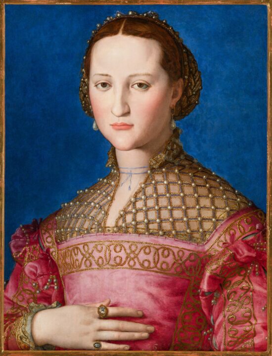
The formality and stylization of these paintings led to their being called “Mannerist,” implying a failed attempt to equal the achievements of the High Renaissance, a slur that the Met’s show proves patently untrue. Frontally and often rigidly posed, necks and fingers impossibly elongated, the aristocratic men, women, and children in the portraits on view are sleekly and wonderfully painted, with an emphasis on signs of status, rather than likeness or lifelikeness. Details of clothing, jewelry, and other luxury items are rendered with fanatical care in glorious color. Bronzino’s solemn, schematic portraits of Cosimo, in armor, and of his wife, Eleonora di Toledo, and their children, sumptuously dressed in amazing fabrics and jewelry, signal power and otherworldly importance. (Copies of such portraits were sent to European courts, to bolster Cosimo’s campaign for international recognition.) Two paintings by Bronzino of excruciatingly elegant young men—one, the handsome, fair-haired son of a banker, his portrait on loan (remarkably) from the Frick Collection—are paradigms of privilege and entitlement. The two were probably insufferable figli di papá—daddy’s favorites—but the paintings are irresistible. It’s startling to realize, given the dates of the tense, lapidary images in “Portraits and Politics,” that many of them are exactly contemporary with Titian’s broadly brushed, loosely drawn poesie at the Gardner.
There are surprises throughout: Bronzino’s striking, unusual profile portrait of the poet Laura Battiferri, celebrated both for her verse and her beauty, presented as a female Dante, holding a book and wearing a transparent veil painted with unimaginable delicacy; Bronzino’s improbable image of Giovanni de’ Medici as St. John the Baptist, nude except for a strategic blue drape, all artfully folded legs and lordly gesture; Francesco Salviati’s sympathetic portrait of the powerful and apparently inscrutable banker Bindo Altoviti, a miracle of seductively painted fur, velvet, and soft beard; Pontormo’s alert man with a book; a red velvet garment said to have come from Eleonora. And more. The exhibition and its engaging catalogue are both marvelous history lessons that bring a fascinating era to life and equally marvelous art history tutorials.
Fast forward more than three centuries and abandon Italy for Northern Europe, by way of Williamstown, Massachusetts, for the Clark Art Institute’s revelatory retrospective “Nikolai Astrup: Visions of Norway,” jointly organized by the Clark and two Scandinavian institutions. Why “revelatory”? Because while Astrup (1880–1928) is revered in his native country, until now he has been almost entirely unknown in the U.S.—and “almost” may be an overstatement. We discover an idiosyncratic painter and inventive printmaker who concentrated on intense, tightly packed landscapes of a very specific part of the world, occasionally populated with figures. Astrup was appreciated early in Norway, exhibiting first at twenty and earning a scholarship that allowed him sojourns in Germany and Paris, voraciously visiting museums, studying at the Académie Colarossi and possibly the Académie Julian and, we learn, becoming interested in the work of Maurice Denis and Henri Rousseau. The young painter’s stay in Paris predated the advent of Fauvism and Cubism, but on later trips to London and Berlin, similarly supported by scholarships, he is recorded as having been particularly struck by the paintings of John Constable, Joshua Reynolds, Lovis Corinth, and Henri Matisse. Apart from these brief forays, Astrup spent just about his entire life in the remote part of rural Norway where he was born, even, after his marriage, living for several years in the surviving part of the parsonage where he was raised, before moving to a new house in the region, where he painted, farmed, gardened, and raised nine children.

Astrup is said to have stayed informed about progressive European art, through publications, but it’s hard to judge. The works at the Clark, dated from “before 1908” to “after 1917,” the most adventurous years of Analytic Cubism, show no awareness of the movement. Yet while Astrup remained attached to perception, he was far from academic or conservative. Neither “modernist” nor “expressionist” characterizes him accurately, but there’s something uncanny, obsessive, stubborn, and untraditional about his work. Both his woodblock prints and paintings are notable for sinuous drawing and superheated color that evokes the brilliance of flowers and vegetation in the endless daylight of a brief northern summer. Space seems elastic, compressed by distant mountains or tipped to suggest high viewpoints; buildings stretch. Interiors and still lifes are more rational, as if disciplined by the geometry of architecture or the presence of figures. In the woodblocks and in most paintings, every inch of the surface is loaded with incident and often densely painted, as if Astrup returned over and over again to the picture.
He returned, too, to certain motifs—the parsonage he grew up in and its immediate surroundings, a strangely shaped nearby mountain, revelers around a Midsummer Eve bonfire—altering his approach and palette in response to changes of season, light, and weather. He explored the possibilities of repetition and variation most unequivocally in his prints, changing color relationships in the pulls, and sometimes expanding the story by basing a painting on the printed image. The complexity, intricacy, and clarity of Astrup prints reverberate generally in his paintings, reinforcing their strangeness. An invigorating tension between illusionism and the flatness imposed by the printmaking technique also persists. It is heightened, especially in the later landscapes, because, without being literal, Astrup’s trees, flowers, and plants are extremely specific, no matter how stylized or schematic; no one has ever painted rhubarb so eloquently. It’s not surprising to learn that he was an informed horticulturalist. Occasionally, an eerie anthropomorphism, somewhere between Charles Burchfield and Disney, animates trees and shrubbery.
The catalogue, with contributions by a raft of scholars and an introduction by Karl Ove Knausgård, is apparently the definitive work in English. And the Clark has had fun with the installation, creating passageways with full color photo-murals that transport us to Astrup’s territory. A staff member told me that she sent a selfie taken against one of these backgrounds to a friend in Norway who demanded to know when she had arrived in the country.
“Uncanny, obsessive, and stubborn” could also be applied to the seductive works in “Tilled Fields: Drawings by Harry Roseman,” at the Frances Lehman Loeb Art Center, Vassar College. Roseman is a painter, draftsman, sculptor, public artist, object maker, conceptual artist, and photographer—and I’m probably leaving something out—so “Tilled Fields” presented only a narrow slice of his activity. Yet the exhibition, spanning about thirty years, in two sections dealing, respectively, with recent and older works in a variety of mediums, also illuminated constants in Roseman’s efforts, among them meticulousness, a fascination with materials, alertness to the phenomena of actuality and to the importance of nuance. The Weave drawings from the 1980s and 1990s are disquisitions on an interlaced grid, like a fictive warp and weft, frayed, warped, compressed, and influenced in different ways by the edge of the paper. The expanses undulate and pulse, evoking the fluidity of cloth, a relationship made explicit by hanging cloth sculptures covered with illusionistic “weaving,” and by the astonishing Bolt, an endless length of muslin to which Roseman has been adding weave patterns, in subtly related colors and subtly varied densities and scales, at intervals since 1989. The more recent drawings, equally labor intensive and demanding of concentration and a steady hand, ring changes on sinuous, concentric lines in configurations ranging from all-over “fields” to repeated clusters. Some pools of lines center on blots or patches that generate surprising shapes, as the lines accumulate and expand. Others seem to invent themselves. They all have a refreshing sense of discovery, a refusal to preconceive. They seem to spring from a desire to court the unexpected: “What will happen if I do this?” The resulting images trigger myriad associations with topography, agriculture, ritual, the microcosm, and the macrocosm, among many other things. It’s tempting to think of Roseman’s making these beautiful, compelling objects as a kind of meditation. So is the focused attention they demand (and reward) from the viewer.

Following the Vassar exhibition, “Harry Roseman: The Fine Art of Getting Lost, Sculpture and Works on Paper,” at Pamela Salisbury Gallery, Hudson, New York, expanded our understanding of the artist’s preoccupations. Drawings made between 2016 and 2021were testimony to the apparently inexhaustible possibilities of repetitive improvisation with blots and concentric lines announced at Vassar. Wall-mounted Folded Plywood reliefs confounded our associations with this familiar material. Roseman treats quarter-inch plywood like paper, folding and overlapping it to make elegant geometric, impossibly thin objects. A series of small “hanging” shapes, made with eighth-inch plywood, further tested our perceptions with flattened, frozen versions of the hanging cloth Weave sculptures, with wood grain substituting for brush marks. Draped Plywood 2 (2016), a sagging curtain of fictive wood grain painted on Belgian linen, compounded the confusion. Spend enough time with Roseman’s eye-testing works in any material, and we begin to see the things around us in unexpected ways.

Elsewhere in Pamela Salisbury Gallery, “Kim Uchiyama: Interludes” showcased recent canvases continuing the artist’s exploration of the expressive possibilities of order, geometry, interval, and associative hues. Uchiyama has looked hard at classical temples and internalized their proportions so thoroughly that they seem to inform all of her paintings, which distill her awareness of the world around her into broad bands of color, spaced vertically at intervals. Uchiyama often plays on the way we involuntarily interpret earth colors, greens, and blues, however minimally presented, as metaphors for land, vegetation, sea, and sky—composing variations on sequences of nuanced ochers, ultramarines, ceruleans, olives, and other resonant, impure hues, and deploying them in unexpected relationships. In her recent works, color and touch have broken loose. Unnamable greens are loosely brushed over elusive mauves. A glowing tawny band stretches below, while a luminous pale blue levitates toward the top or vice versa. The rarified suggestions of landscape still make themselves felt, but there is a new declaration of the painter’s will and presence that enhances the image. We are encouraged to think not only about allusion, however oblique, but also about the making of the painting. I’ve followed Uchiyama’s work for some time, so I feel confident about saying that the works in “Interludes” are among her strongest and most achieved to date.
Back in the City, at Pace, “Thomas Nozkowski: The Last Paintings” was further evidence that his death in May 2019 deprived of us of one of the most original, inventive, and fascinating painters working today. As always, Nozkowski’s last abstractions defy words. Small—22″ x 28″—strange, and unpredictable, they are exquisitely painted, with a range of applications, from delicate brushstrokes to rhythmic, aggressive marks to rubbed out patches, and more. They are also fiercely intelligent, beautiful, and funny. The indescribable forms that dominate many of the paintings—looming, bulbous, sometimes built of accumulations of smaller incidents—hold sway against subtly brushed indeterminate expanses, only occasionally encountering the kind of complicated variations on the grid that Nozkowski often explored. The color is ravishing, often extraordinarily complex but at the same time, seemingly inevitable.

As he taught us to expect, Nozkowski’s last enigmatic abstractions combined discoveries that emerged from the act of making with images derived from things seen, read, or experienced, from natural phenomena encountered on his walks near his home and studio in the Shawangunks to fragments of movies. These unnameable, eccentric, provocative images seem to be very specific but impossible to pin down. We feel we are about to crack the code when it slips away—as the artist, who never revealed the origins of his imagery, wished. He simply presented us with eccentric, richly associative, alluring paintings that insist that we slow down and pay close attention. When we do, we are captured by a universe of different kinds of painting languages, scales, drawing marks, and hues as complex and wide-ranging as their author’s dazzlingly well-furnished mind. At a time when painting is asked to address all kinds of political, sociological, and ecological issues that are usually better dealt with verbally, “Thomas Nozkowski: The Last Paintings” reminds us of the potency and profound importance of the wordless and the visual.