At the Galleries

As if to make up for all those months of deprivation, museums and galleries this past spring offered a wealth of provocative exhibitions—as long as you planned ahead and reserved a time. At the Metropolitan Museum of Art, a magnificent overview of Francisco de Goya’s prints and drawings demanded close attention, while a revealing Alice Neel retrospective rewarded often long waits for entry; Neel’s uncompromising “pictures of people,” as she called them—of her friends, family, neighbors, and sometimes, people who simply caught her eye—made the effort worthwhile, as did the relatively uncrowded galleries, once you were allowed in. Frick Madison, the installation of key works from the collection, in Marcel Breuer’s former Whitney Museum during the upgrade of the 70th Street mansion, allowed us to see familiar, celebrated works in new relationships, sparsely hung, at eye level. Renaissance bronzes, Asian and European porcelain, fabulous carpets, rare furniture, and sculptures, usually dispersed throughout the interior and forced to compete with the paintings, are installed in informative chronologically and geographically related groups that make us pay close attention to remarkable objects we may previously have only glanced at. Sadly, the Goya show ended at the beginning of May, but Neel can be seen through the summer, and we’ve got several years to acquaint ourselves freshly with the Frick collection in its temporary home.
The most relevant exhibition of the past season was “Grief and Grievance: Art and Mourning in America,” at the New Museum, on the Bowery, a show that just about all of us needed to see and think about. Conceived and initiated by the Nigerian born curator Okwui Enwezor, who died before “Grief and Grievance” became a reality, the show and its massive catalogue were completed with the assistance of Naomi Beckwith, Massimiliano Gioni, Glenn Ligon, and Mark Nash. The museum’s entire building and lobby were filled with paintings, photographs, videos, sound works, installations, mixed media efforts, and some sculpture—historical, recent, and commissioned for the show—by 37 Black artists from different generations, at different stages of their working lives, from the internationally acclaimed to the cultishly obscure. (There were also some odd omissions, such as the sculptors Martin Puryear and Chakaia Booker, or the painters Robert Colescott and Enrico Riley. Were they not asked, or did they refuse?) The impetus for the show, according to Enwezor’s catalogue essay, was “the crystallization of black grief in the face of a politically orchestrated white grievance.” I’m not sure what “politically orchestrated white grievance” is, but I found the show to be compelling, deeply moving, instructive, puzzling, and annoying—the last because of the loud, inescapable soundtracks of the video installations on every floor.

The effort to tune out the noise was rewarded, however. The raw physicality of Mark Bradford’s layered, ragged abstraction made it a potent equivalent for struggle and survival. Rashid Johnson’s enormous wall of shelving holding tropical plants, African export products, books by Richard Wright and Ta-Nehisi Coates, and small videos of African dancers, was like a vast three-dimensional, abstract but allusive painting. Kerry James Marshall’s series of elegiac, witty paintings of interiors, commemorating celebrated musicians, civil rights figures, and private strife, complete with glitter, insisted that we register every telling, wonderfully painted detail. Photography was particularly strong. Witness Dawoud Bey’s elegant Birmingham Project, a series of paired portraits of old and young, and LaToya Ruby Frazier’s poignant images of working-class America. Nari Ward’s immense Peace Keeper, a sliced-hearse covered with grease and peacock feathers, caged, on a bed of tail pipes, with mufflers slung above, was an obvious metaphor, but nonetheless a fascinating object. So was a work by the thirty-year-old Diamond Stingily, an artist new to me: three worn, much repainted doors with multiple locks, lined up against the wall, with baseball bats leaning on them—urban life in questionable neighborhoods made tangible. Like Ward’s construction, Stingily’s piece was very literal, but effective. And much more.
Enwezor’s thesis was brilliantly summed up—indeed, the entire exhibition was encapsulated—by Arthur Jafa’s video, Love Is the Message, the Message Is Death: about seven minutes of collaged video and film clips, vintage and current, vividly presenting moments of joy, triumph, abuse, dignity, stereotype, achievement, defeat, and resistance, flipping between black-and-white and color footage, high and low resolution. We saw fragmentary images of churchgoing, rock and rap performances, sports events, politics, civil rights actions, everyday life, police brutality, horrific news stories, street dancing, and old movies, amateur and professional—among other things—punctuated by shots of sunspot activity, with a wide ranging soundtrack. It was overwhelming and fierce, at once indictment and celebration, elegy and exaltation. Most of “Grief and Grievance” was illuminating, thought provoking, and highly recommended. Jafa’s video was essential watching.
The evolution of Julie Mehretu, represented in “Grief and Grievance” (and in a solo show at Marian Goodman Gallery last winter) by recent work, could be studied at a handsomely installed retrospective spanning about two decades, at the Whitney Museum. I was eager to see the entire trajectory of Mehretu’s work laid out, since I had been very interested in her obsessively complex, delicate early works, with their unstable scales and their sometimes conflicting allusions to mapping, invented writing systems, and architectural drawing. But I have found her more recent work, which seems wholly dependent on digital technology, to be cold and manufactured, in contrast to the seemingly deeply felt earlier work with its wristy touches. The difference is no accident. I’ve heard more than one tech-savvy artist note, from their own experience, that the ongoing changes in Mehretu’s work—the overlapped, schematically rendered building façades, the perspectival floating colored planes, the soft-edged smudges, and the blurred sweeps—correspond to the developing possibilities of Photoshop and its equivalents. I’m willing to believe it.

Obviously, the issue is not how things are made, but what the artist ends up with. My reservations about Mehretu’s recent work are not triggered by her method, but by the results. While the exhibition’s drawings from any period were notable for their intimate marks and arcane invented calligraphies, the paintings were increasingly predictable and manufactured-looking, over the years, their color more acidic and tonality more theatrical. Their alleged origins in political and social upheavals, cataclysms, and disasters, remained, at least to my eye, obscure to invisible. What was more evident was Mehretu’s labor-intensive system: a complicated web of fragile lines, overlaid with floating planes, sometimes in color, animated by fluid hand-applied “calligraphy,” which remained remarkably similar in each painting, as if it were a repeatable alphabet. A welcome exception was a group of works made between 2010 and 2015, in response, we learned, to the Arab Spring. They seemed more spontaneous and expressive, with more evidence of the hand—or at least, less evidence of the computer—and, for once, a stronger correspondence between the artist’s declared intention and the material presence of the work. I take Mehretu very seriously. I wish I were as enthusiastic about where her paintings are going as I am about where they have been.
Katherine Bradford’s “Mother Paintings,” at Canada gallery’s Tribeca space—one of her strongest shows to date and one of the strongest of the season—assembled works made since the start of the pandemic. The obliquely stated theme was the universal desire to be taken care of in difficult times, which translated into paintings populated by scale-shifting, economically conceived, sometimes gravity- and logic-defying figures, ablaze with full-throttle color, now superheated, now deep and brooding. Bradford’s personages stood side by side, tenderly supported each other on laps or extended their arms to make contact, their expressive attitudes subtly dictated by the given verticals and horizontals of the canvas. Bradford plays fast and loose with size relationships and even anatomical coherence, but we’re always convinced by her cast of characters, many of whom seem to be determined women, despite sometimes ambiguous clothing and other indicators.

Among the most memorable of the recent paintings (all made in 2021) was the boxy Fever, in which long arms reach in to feel a forehead and touch a back, with the glowing orange of hands and head signaling heat and firmly knitting together blocks of Matisse-ian pinks and blues. Throughout, Bradford’s changing viewpoints suggested disequilibrium and disquiet. In Mother Joins the Circus—Second Version, a pale blue horizontal figure is carried off by two others, one teetering on high heels, the other leaning in, feet outside the edge of the painting, while another figure, inverted, seems to block their progress. Guest for Dinner, with its deep, seductive blues and purples, was among the most spatially and conceptually mysterious of the recent works, pitting a stacked trio of small, loosely painted dinner tables against an androgynous, looming figure who fills the right side of the canvas. As Bradford has taught us to expect, we felt that something very specific was going on, without being quite sure of what it is. Confronted by her paintings, we try to tease out an elusive narrative and are captured by the firm abstract architecture of her compositions—the massing of planes and the implied geometric scaffolding that disciplines her characters—along with the sheer physicality of paint, from washy to substantial. The “Mother Paintings” announced a zone in which abstractness and evocative reference coexist—or maybe duke it out—with the dazzling color and the range of paint applications and touches intensifying the emotional effect. Bradford keeps getting better and better.
Among the most haunting exhibitions of the season was “John Lees: New York,” at Betty Cuningham Gallery, on the Lower East Side, a gathering of deceptively deadpan images of unpicturesque landscapes, people, a couple of dogs, and a clawfoot bathtub. “New,” in relation to Lees, is an interesting concept, since he works on his modest size canvases for years, even decades, building up crusted surfaces, sanding them down, and building them up again, until the sheer accretion of scrubby pigment subsumes details and sharp edges. (A large scroll drawing, of multiple sections, with multiple dates, bore witness to his returning to the same spot repeatedly.) Lees keeps us off balance. We focus on the nominal subject of a seemingly casual painting such as Hills of Home (1997–2021), charmed by the black-and-white dogs, the man in the red jacket, the chainlink fence, and the sparsely wooded rolling landscape. Then the intense physicality of the painting takes over, turning the unassuming quotidian scene into an elusive memory, a hard to grasp recollection. The density of the surface makes us read the painting as an all-over abstraction, concentrating on the play of golden yellow, orange, and pink flickering across the picture. Our awareness of the brute fact of pigment on a flat expanse is heightened by the economy with which the images are presented, so silted up with paint that only their essential shapes remain visible.

The war between reference and the physicality of pigment intensifies in the vaguely geometric Blue Courtyard (1986–2020). We intuit hints of architecture and trees through the layers of touches and dabs. The tattered surface is not simply a metaphor for the passage of time; rather, it’s as if Lees made the long duration of his engagement with the painting the subject of the work. He plainly admires the thickly painted, often ruinous paintings of Albert Pinkham Ryder, and while Lees’s paintings are more matter-of-fact than Ryder’s and free of overt Romantic drama, they are almost as wonderfully strange. Take, for example, the inexplicably compelling Bathtub (1972–2010), with its curving, inquiring spout, as encrusted as a Greek marble statue recovered from an ancient shipwreck, or its landscape cognate, Pond (1991–1993, 2011–2012), similarly composed, with a centralized oval filling most of the canvas, an image apparently of nothing. Lees’s paintings sneak up on us, attracting us with their seeming simplicity and holding us with their relentless complexity and physical presence. I can’t account for their uncanny power. But they must be seen in the flesh, if their lush materiality and eye-testing simplifications are to speak most eloquently.
“Uncanny power” applies, as well, to Eleanor Ray’s small—roughly 6” x 8”—landscapes and interiors at Nicelle Beauchene Gallery in Tribeca. Ray has made intimate, forthright, broadly painted records of her perceptions, intensified by memory, since she was a student. What’s impressive—in addition to the clarity and firmness of her work and the invigoratingly “off” quality of her color—is her refusal to repeat herself. She finds new subjects, when she travels, along with fresh viewpoints and themes. Her recent paintings bore witness to stays in New England, the West, and Italy, with observation filtered through recollection, absent niggling detail, without losing specificity. Wyoming landscapes and frescos by Piero della Francesca and Giotto competed with views of distant mountains through studio windows. The strongest works played nature against the geometric and man-made, as in an economical glimpse of bands of dry grasses and hills through the slot of a bird blind, or in notations of planes of sunlight cutting against long views framed by windows. In Great Salt Lake (2020), Ray turned rocks and sagebrush into rose and gray-green building blocks, carved and animated by the fall of light. Elsewhere she noted the elemental relationships of zones of dead grass and snow. Her palette of heightened blues, subdued greens, creams, and tawny ochres evokes place, season, and time of day without being literal or exaggerated, further abstracting her seemingly unassuming but rich works.

Ray paints on panel with a rather dry brush, so that every deliberate touch manifests itself, as it does in Giorgio Morandi’s still lifes—which Ray clearly admires and has learned from without imitating. Their small size notwithstanding, her recent paintings announce themselves at a distance, but demand close scrutiny. Looking hard, we discovered a minute snowy owl in a winter landscape, a meadowlark on a pole, the accoutrements of a studio, or the gestures of Piero’s Annunciation in Arezzo. But we were equally aware of how the randomness of the world had been tamed and ordered. Ray generously shares her preternatural awareness of her surroundings and reveals its abstract underpinnings, rewarding us for studying her paintings and making us concentrate in new ways on the places we inhabit.
In the early 1970s, in residence at the British Academy on a Rome Prize, Graham Nickson decided to tackle the most transgressive subjects conceivable for a young, ambitious painter at the time: sunrises and sunsets. He has continued to do so ever since, waiting for dawn in the dark, his palette ready, poised to respond to the spectacle about to unfold. If this suggests the atmospheric, evanescent, pastel images of the Romantic era, think again. Nickson confronts the power of the sun with gorgeous, ferocious hues, dramatizing shapes and edges, turning cloud formations into battling warriors, without, however, ceasing to seek and reveal the essential Platonic order underlying the appearances of nature, contradictory as that may seem. All of this was visible in “Graham Nickson: Passages,” at Pamela Salisbury Gallery in Hudson, New York, a stunning group of Covid-era watercolors—sunrises, full-length portraits of trees, and studies of red amaryllis—plus a few small, dispassionate oils painted during his sojourn in Rome, like the remains of a disassembled predella—the narrative scenes in the lower part of a Renaissance altarpiece—with urban views instead of martyrdoms.
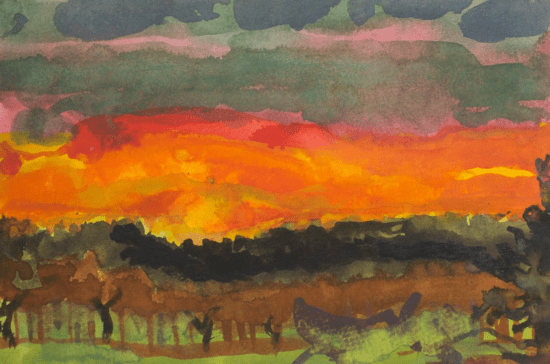
The sunrises, with their centralized, stripped-down compositions, their undulating cloud shapes, and above all, their glowing oranges, golds, blues, and pinks, threatened to shift into pure abstraction before they began to call up natural phenomena once again. The images of trees made adversaries of bare, gnarled branches and a spiky evergreen, tightly overlapped in the center of the sheet, forming a bristly exclamation point against radiant skies. In some, sinister crows added a sprinkling of smaller, repetitive shapes, somehow darkening the mood of the pictures. Despite Nickson’s subtle emphasis on vertical and horizontal elements in his recent watercolors, his fluid touch, the vivid sense of the motion of his hand, applying paint, and the sumptuous color, made the images lush and florid—Dionysian, in contrast to the cool Apollonian paintings made in Rome in the 1970s. Is this Nickson’s late style—as art historians categorize the uninhibited work of gifted, mature artists, informed by everything they’ve learned over the years and freed from the desire to please anyone but themselves? However we explain it, the vitality and idiosyncrasy of his recent watercolors were notable.
Back in Midtown Manhattan, “Larry Poons/Frank Stella: As It Was, As It Is,” at Yares Art through July, provides a rare look at early work by these radical pioneers (and speed aficionados, Poons for vintage motorcycles, Stella for fast cars). Poons, born 1937, and Stella, born 1936, have been friends and fans of each other’s work since the late 1950s and early 1960s, when they both began living in New York and dramatically rethinking the possibilities of what an abstract painting could be—as they both have continued to do, throughout their long, productive, and multifaceted working lives. In 1969, they were the two youngest artists included in the legendary exhibition “New York Painting: 1940–1970,” curated by Henry Geldzahler at the Metropolitan Museum of Art. Both admired and were friendly with Barnett Newman, who encouraged their explorations.
The selections in “As It Was, As It Is,” from the 1960s and early 1970s, reveal both artists’ early fascination with disrupting perception, Poons in an impressive group of the vibrating Dot paintings that first established his reputation, Stella through representative examples of his paired Concentric Square canvases, along with one of the brash Protractors that followed. Poons’s luminous expanses of unnameable hues are punctuated by irregularly placed lozenges of intense color that seem to pulse against the ground, testing the limits of our sight. Stella’s Concentric Squares nest blazing primaries or a range of grays from black to white, teasing us with suggestions of recession or progression, while the Protractors’ overlapping, intersecting arcs and lush hues suggest even more complex, shifting optical illusions. Both artists manage to delight us and make us question what we are seeing at the same time.
The “As It Is” section of the show presents recent works by both artists: a series of small, square urgently brushed and swiped paintings by Poons and a group of lively, tabletop extruded sculptures by Stella. It’s clear that the daring, energy, and desire for intensity that characterizes both artists’ early work is still abundantly present, even though during the decades bracketed by “As It Was, As It Is,” both Poons and Stella worked in many different ways. But while their recent paintings and sculptures, on view at Yares, are formally and conceptually distinct from the early examples, they are just as unexpected and audacious. Poons’s recent paintings share the chromatic complexity and explosiveness that marks his work from any period, while Stella’s sculptures continue his lifelong interest in the possibilities of new materials and in how technology can be claimed and transformed for ambitious art. An important caveat: “As It Was, As It Is” must be seen in actuality to be fully grasped. Since the show will be on view well into the summer, there’s time to visit.