At the Galleries
The rigors of a New York winter were relieved this year by a conspicuously diverse group of exhibitions by a conspicuously wide-ranging group of artists: modern masters, current notables, emerging and emerged talent. Geographically, these shows were also dispersed: Harlem, Chelsea, the Upper and Lower East Side, Brooklyn, and, for the dedicated, Beacon, New York, up the Hudson. It can be argued that the most relevant questions were provoked by “Posing Modernity: The Black Model from Manet and Matisse to Today,” at the Wallach Art Gallery, in Columbia University’s new 125th Street Renzo Piano campus. The exhibition examined the role of people of color in the work of a distinguished roster of modernists. Paintings, works on paper, photographs, sculpture, and film were put into the service of an exploration of everything from the use of black females as subjects by male, predominantly white artists to black artists’ representations of black women. Organized by Denise Murrell, the Wallach’s Ford Foundation post-doctoral research fellow, the show assembled a significant selection of works by the title’s eponymous stars, along with equally important examples by Frédéric Bazille and Edgar Degas, the Harlem Renaissance painters Charles Alston and William H. Johnston, and contemporaries such as Mickalene Thomas, among many others, plus period photographs by Nadar and other pioneers.
Rather than merely lamenting the prurient “male gaze” and the inherent voyeurism bound up nineteenth-century Orientalist images that emphasized the exoticism of their subjects, the exhibition strove to underline evolving approaches to the black model, changes in attitude that the curator identifies as crucial to modernity. Bazille’s ambitious La Toilette (1869–70), with its Orientalist overtones—a voluptuous (white) nude attended to by a (white) woman in a striped dress and a kneeling, half-clad black servant—was contrasted with his two intimate “portraits” of the same model (probably Laure, who appears in Edouard Manet’s Olympia, bearing a bouquet) close-up, fully clothed, individualized and arranging flowers. Olympia was not included in the show; one hopes it will be, in the exhibition’s expanded version, along with added works by Théodore Géricault and others, to be seen this spring in Paris. As consolation, there was Manet’s stunning portrait of Charles Baudelaire’s mixed-race mistress, reclining amid a froth of white skirts. Photographs of the well known, such as Alexandre Dumas père, who boasted of his heritage, and unnamed black models brought the black inhabitants of nineteenth-century Paris to vivid life.
We were forced to consider the subject matter of familiar works, such as Edgar Degas’s studies of the circus performer Miss Lala, in new ways, urged to ponder choices and intentions. Yet, provocative as the questions raised by “Posing Modernity” were, it was impossible not to chafe at the way all the exhibited works were presented as illustrations of ideas, no matter how aesthetically inventive or exciting they were. A pair of paintings by Henri Matisse of two of his favorite models, the North African Aisha and the French Lorette, were discussed in terms of subservience and equality—in one canvas Aisha sits and Lorette stands, while in the other both stand—with no acknowledgement of the formal oppositions that clearly triggered the works. The exhibition’s many splendid drawings and prints of Aisha made it plain that Matisse treated the distinctive features of his dark-skinned model with exactly the same passionate attention and formal rigor that he did those of the blonde Russian Lydia Delectorskaya, translating wide eyes and full lips into economical, expressive lines. Matisse’s modernist inventiveness was clearly not triggered or altered by differences in skin color. For that matter, his forms are not “flattened,” as the wall texts maintained several times; he translated his acute perceptions of three-dimensionality onto the two-dimensional surface of the paper or canvas. And while I’m taking exception to wall texts, it certainly wasn’t Sarah Baartman’s “physiognomy” that earned her the name “the Hottentot Venus,” when this unfortunate African woman was demeaningly exhibited as a bizarre specimen in the nineteenth century.

Moving south, “The Self-Portrait, from Schiele to Beckmann,” at the Neue Galerie, examined a different relationship with the model—that of artists with themselves—through a sumptuous assortment of about 70 paintings, works on paper, prints, photographs, and the occasional sculpture, mostly from the museum’s own holdings, supplemented by key international loans. The selection spans the gamut of possibilities from dispassionate observation to full-throttle expressionism, from self-love to self-loathing, from optimism to despair. The first gallery offers a capsule history of the self-portrait tradition, beginning with a sixteenth-century painting on copper, a seventeenth-century version of an Albrecht Dürer, some tiny but potent Rembrandt etchings, and a classicizing Anton Raphael Mengs, painted in 1776. These are combined with familiar, hyper-stylized drawings and canvases by the self-absorbed Egon Schiele, as promised by the show’s title. Proud of his long, skinny limbs, he presents himself in the nude, in a rumpled coat, smartly dressed, as a lover, and as St. Sebastian, among other incarnations.
The second gallery, titled “Expressionism,” holds surprises: some pitiless Käthe Kollwitz drawings, especially Frontal Self-Portrait (c. 1910); the little-known, short-lived Richard Gerstl’s Self-Portrait in Front of a Stove (1906–07), two tightly focused, dryly painted works by Paula Modersohn- Becker, one nude and pregnant, and a tightly-cropped, meticulous head by Grethe Jürgens, someone new to me. Well-known, compelling works by Oskar Kokoschka and Ernst Ludwig Kirchner are combined with unfamiliar ones, such as Ferdinand Hodler’s celebration of his neat beard and broad shoulders and Ludwig Meidner’s nervous self-characterization as a tense urbanite.
There are still more surprises in the last gallery, titled “New Objectivity,” such as three wrenching paintings by Felix Nussbaum, made between 1940 and about 1943, when he was variously hiding in Brussels and held at an internment camp, before being sent to the concentration camp, where he died at 40. Nussbaum’s moody, haunting self-portraits itemize the horror and foreboding of his last dreadful years. Max Beckmann is, not surprisingly, the star of this section, with multiple examples, as befits someone who frequently painted himself in various guises. Most dramatic, perhaps, is the Neue Galerie’s dazzling Self-Portrait with a Horn (1938), painted in exile, showing the bullet-headed painter in a pink-striped robe, raising a horn, as if to sound an alarm. The other standout is Lovis Corinth’s Last Self-Portrait (1925), a terse, roughly brushed summing up of a lifetime of self-scrutiny. Intimate drawings, watercolors, and photographs provide a coda to this fascinating show.
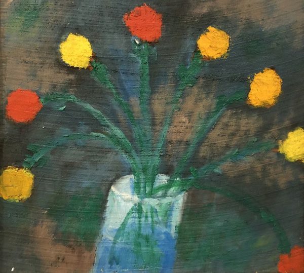

The Northern tradition is continued at “Jan Müller: Flowers,” at Bookstein Projects on the Upper East Side, a survey of still life paintings from the mid-1950s by this phenomenally gifted, tragically short-lived painter. Müller, born in Germany in 1922, fled Hitler with his family, arriving in 1941 in the United States, where he died at 35 of a heart condition. A student of Hans Hofmann’s, Müller first painted mosaic-like abstractions influenced by his teacher, returning to figuration with the urgent, stylized, expressionist images of biblical and mythological themes for which he is best known—a remarkable trajectory in 1950s New York, when anything other than abstraction was regarded as possible only for amateurs and artists of the past.
Müller’s modest paintings and pastels of casually disposed flowers in cylindrical vases can be read as the link between his abstractions and his fierce narratives. At first, the still lifes seem childlike in their economy, even naïve in their simplicity, yet they become increasingly abstract and intense the longer we spend with them. The patches of clear primary colors that suggest flower heads, along with Müller’s insistent touch, begin to remind us of Hofmann’s vigorous orchestrations of saturated hues and his ferocious stabs of a loaded brush. We begin to see Müller’s still lifes as abstract fabrics of color out of which recognizable, simplified flower images begin to emerge. The flower paintings are at once tender and tough, as if even when he explored ostensibly benign, even banal, subject matter, Müller’s awareness of his own impending mortality animated his paintings. Patches of red, yellow, and blue float against brushy, shifting grounds. Stems fan out in assertive strokes of deep green. These deceptively forthright paintings are the harbingers of his last, haunting narrative paintings.
Müller exhibited regularly during his brief lifetime at the Whitney Museum of American Art, the Jewish Museum, the Museum of Modern Art, and the Venice Biennale. He’s been seen less often, recently. Given the continuing influence of Philip Guston’s late work and the burgeoning interest in pared-down, lushly painted, expressive figuration these days—think Katherine Bradford, Matthew Blackwell, or Dana Schutz, not to mention the late Bob Thompson, Müller’s devoted acolyte —isn’t it time for a full-scale retrospective, a demonstration of the achievement of a prescient, independent-minded artist?

Re: Dana Schutz, it would be nice to be able to say that “Imagine Me and You,” her exhibition of recent paintings and sculpture at Chelsea’s Petzel Gallery, was a evidence of the current relevance of expressionism. Certainly “Imagine Me and You” demonstrated Schutz’s admiration for Guston’s late works and for Max Beckmann, as well as her ability to apply paint expressively. She’s a bold colorist—all in all, what aficionados call “a real painter.” The problem, for me, is that her present subject matter seems arbitrary and pointless. Schutz’s refusal to ingratiate is admirable, but her grotesque, cartoon-like imagery seems gratuitous, and her drawing unconsidered, at best, and downright inadequate, most of the time. The grotesqueries can be repellent, and there’s little in the way they are realized to counteract the essential dullness of their shapes and forms. In the best of the Gustons that Schutz pays homage to, even the most brutish characters are conjured up with an achingly sensitive line. Much of the potency of Guston’s late paintings resides in the tension between the brash, distressing images and exquisitely delicate hues applied with great refinement; in the pictures in which raw hues seem slapped onto the canvas, that tension is replaced by a relentless sameness of emphasis.
Everything in “Imagine Me and You”—surface, color, image, and drawing—sounded the same brassy note. The most engaging painting was the large, confrontational Mountain Group, a crowded summit, with the artist at work from an insecure perch on a steep side, a Guston-esque finger, and Guston-esque ladders punctuating the space. Because the cartoon characters were tightly pressed together, the drawing that described them seemed less expedient and the shapes less routine. Perhaps Mountain Group succeeded best because its gathering of characters, some with overtones of other works of art, could possibly be read as emblematic of making paintings, rather than as a random grouping. Or not. The same could not be said of the exhibition’s sculptures, which had little sense of spatial articulation and an unconvincing relationship between surface and mass. Just grooving a lump with one’s fingers doesn’t make sculpture.
At Jenkins Johnson Gallery, in Brooklyn, Enrico Riley’s “New World” brought together recent paintings and drawings dealing obliquely and/or metaphorically with present-day urban violence, resulting grief, and the ineradicable legacy of the Middle Passage. Like Schutz, Riley clearly has learned a lot from Guston and Beckmann and seems to strive for the ferocity and uncanniness of both artists’ work. We never quite see the cast of characters in “New World.” They turn away or exist as fragments and cropped body parts. An oversized gun barrel protrudes into the canvas. Hands like catchers’ mitts clutch flowers or horns. Women are visible only from their ankles to their thick-heeled platform shoes. In the arresting Untitled: Crepuscular, New World Old Game, enormous chunky weapons and a stylized flower held by an oversized fist all but obscure a distant ship; then we notice the burning cross in the background. Abrasive images are opposed by Riley’s seductive palette and suave touch. Some of the best paintings were the most ambiguous: the tight knot of forms in Untitled: Condolences—a giant hand emerging from an immaculate cuff to hold a geometric flower, against near-abstract forms suggesting a hand pressed against a face in grief—or the sculptural arch of hand and horn, elevated above the top of a stone tower against the sea in Untitled: Morning, Freedom Song, Tranquil.
Riley’s color is always lush, his drawing unfussy but never crude or cartoon-y. It was possible to savor the paintings in “New World” for their gorgeous color and fine paint-handling, and simply to accept the images at face value. But the longer one looked, the more loaded the pictures became. Their disjunctive images became discontinuous memories, snippets of unforgettable things seen, read, or heard, the kind of unanchored images we preserve from earliest childhood, and more. The fiercely intelligent Riley once made strikingly elegant, cerebral abstract paintings that paid homage to his musician father or to astronomy, among other things. They were beautiful and satisfying, but ever since figuration insisted on returning to his paintings, some years ago, his work has become increasingly allusive and elusive, at the same time. It’s what makes Riley’s recent paintings hard to ignore and harder to forget.

Back in Manhattan, on the Lower East Side, Lesley Heller Gallery showed “Jim Osman: The Walnut Series,” recent sculptures constructed in wood, mostly polychromed, that rang changes on the implications of furniture, architecture, toys, and high modernism. Most of the works were intimate, compact, modest-sized pieces that reminded us of the action of the hand in assembling their geometric parts. At once witty, playful, and intensely serious, they made us think simultaneously about Cubist construction and modular children’s blocks, as we enjoyed the play of the warm hue of walnut against painted elements. Most of these engaging structures were set on leggy, wonky “tables,” some like casually piled open boxes, that functioned as supports while entering into a lively conversation with the sculptures.
“Lively” was the operative word. Osman’s constructions are based on deceptively simple relationships—piling, bridging, angling—of fairly uncomplicated geometric shapes of various densities and thicknesses. The sculptures, for all their complexity and inventiveness, seem to have been assembled directly, as if they were held in place by gravity alone. Unexpected changes in color and texture add seasoning, both emphasizing and opposing form: intensely colored bars and blocks or even occasional “alien” elements, such as a disc of dried paint from the bottom of the container, like a stylized flower. A group of tiny, dense sculptures tilted toward associations with toys, while the exhibition’s single large piece, Still, 2018, read as deconstructed architecture. The unpainted, stacked Still (almost eight feet high), for all its size and authority, had a delightfully provisional quality. It suggested, because of the character of its components, a temporary, virtuoso, vertical arrangement of slightly illogical benches, tables, and boxes, as precarious as a house of cards. The contradiction between the provisional quality of the whole and the meticulousness of Osman’s joinery, like the contradiction between the seeming literalness and irrationality of the sculpture’s parts, made Still a standout, notwithstanding the allure and charm of the polychrome pieces. I look forward to seeing more large Osmans on view in future.

A high point of the winter was the inauguration of the second stage of Dorothea Rockburne’s ravishing long term installation at Dia: Beacon, in Beacon, N.Y. Last year, a stunning group of works from the 1960s and 1970s was placed on view in Dia’s light-flooded, high-ceilinged galleries; they are now joined by two more galleries devoted to works from the 1970s and 1980s, all arranged under the artist’s close supervision. The ensemble provides an overview of Rockburne’s poetic fusion of clear-headed lucidity and sensuous response to the effects of such unlikely materials as heating oil, grease, chipboard, carbon paper, and contact cement, along with more conventional ones, such as linen, paper, Conté crayon, chalk, and gesso, all used in unexpected, compelling ways, at impressively generous scale.
Rockburne makes us concentrate on nuance: the delicate projections of stiffened linen folded into a geometric relief, the fragile traces of a chalk line snapped against the wall, memories of drawing from the initiating stages of a work. We become mesmerized by the difference between a real edge and a faintly drawn line, between a change in level and a change in material. Subtle, seemingly unwilled shifts in surface, usually the result of physical processes, such as the application of oil to paper or the pasting of thin layers, coexist with evidence of underlying mathematical discipline. The progression of the angular planes of the folded linen works, for example, is determined by Rockburne’s use of the Golden Section, while another series is haunted by her study of the proportions of Egyptian art and architecture. And more. At times, her confrontational, wall-mounted constructions suggest the artifacts of some unknowable, advanced (or vanished) civilization privy to a kind of logic far more sophisticated than ours.
The most spectacular gallery of the Rockburne rooms is a gleaming white space dedicated to the multi-part carbon paper installation originally made in 1973 and now reconstituted for Dia by the artist. Frail rectangular, diamond-shaped, and triangular sheets of carbon paper seem tenuously attracted to the walls and floor of the space, in counterpoint to an ample scaffolding of crisply drawn, unimaginably slender lines. Over time, apparently, the pristine whiteness will be compromised by floating granules of carbon from the paper, dislodged by air currents, even by the breath and motion of visitors entering the room. That makes a return visit to Rockburne’s installation essential. Dia:Beacon is easy to reach by train, and the trip along the Hudson is especially lovely in the spring.